
Ah, Google. Holding the fates of search traffic in its hands. The next Google algorithm change on April 21st means that your site’s mobile friendliness is going to be taken into account.
Let me break it down…
Google’s Algorithm
Google’s algorithm is a program that uses several bits of information to display the relevant results when you do a search. Google uses things like keywords, content age, your location and PageRank to decide what to display. The next algorithm change on April 21st 2015 is a move towards showing content that displays nicely on the device the searcher is using.
Mobile friendliness as a ranking system
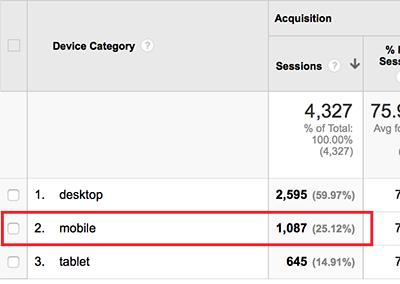
Google will use your website’s mobile friendliness to decide where it should appear in the search results on mobile devicess. This is huge because so much traffic now comes from handheld devices. Check your stats on Google Analytics, I know that my site gets approximately 25% of its traffic via mobile.
Why are Google doing this?
Google want their users to receive the best quality search results possible, and that means serving them content that will display nicely on, and be optimised for, their devices.
How do I know if my site is mobile friendly?
The easiest way is to use the free tool that Google has created, the Mobile-Friendly test. By entering your URL, Google will check to see if your website is already mobile friendly.
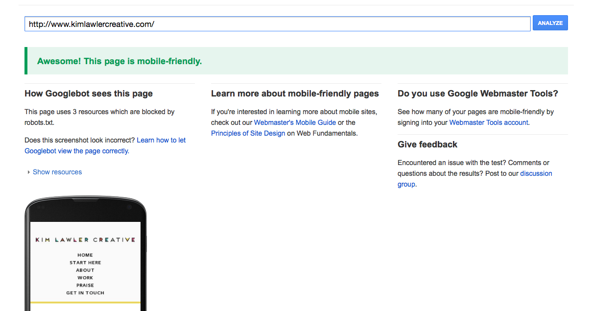
If you get this message, you’re all set.
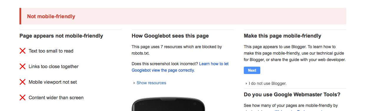
If you get this one, you’ve got some work to do (you won’t even believe what website this was, a huge, huge blog).
Help! My site’s not mobile friendly!
There are a few ways to fix this, and it all boils down to what platform you’re running your website with. Briefly, here are a few fixes for common set-ups. Google have also created a great resource on the options available for you, read that here.
Self Hosted WordPress
- If you’re thinking of upgrading your theme, or getting a custom design, make sure you’re getting mobile friendly (or responsive). The base themes (twentyfifteen for example) are all mobile friendly.
- You can use a plugin that will server a different version of your site to mobile uses. Jetpack and WPTouch are two such plugins.
- Convert your current theme with the help of a developer. This can be messy, though, and I wouldn’t recommend it.
Blogger
The easiest fix for Blogger is to simply turn on your mobile template. Blogger provides one by default, and whilst it’s not the prettiest of templates, it does what it does. Head to your blog template settings, and click the gear icon under the “Mobile” template. Then select a mobile template. Voila!
Of course, you can also go down the route of using a mobile friendly template in the first place, which will look way better than a default Blogger template!
Things to keep in mind
Based on the previous few years, mobile traffic is only set to increase. While you might want to put a quick fix in place now, it’s imperative that you take time to consider how your website behaves on mobile devices from now on in. That means making sure that your site looks bomb-awesome on all devices, not just desktop. I’ve offered responsive web design as standard for the past few years, and I’ve really sung its praises to all my clients. If you’re set to start working with a web designer any time soon, make sure your site’s going to perform well across all devices.


